Wednesday, April 13, 2016

Digital Photography - Shutter Speed C


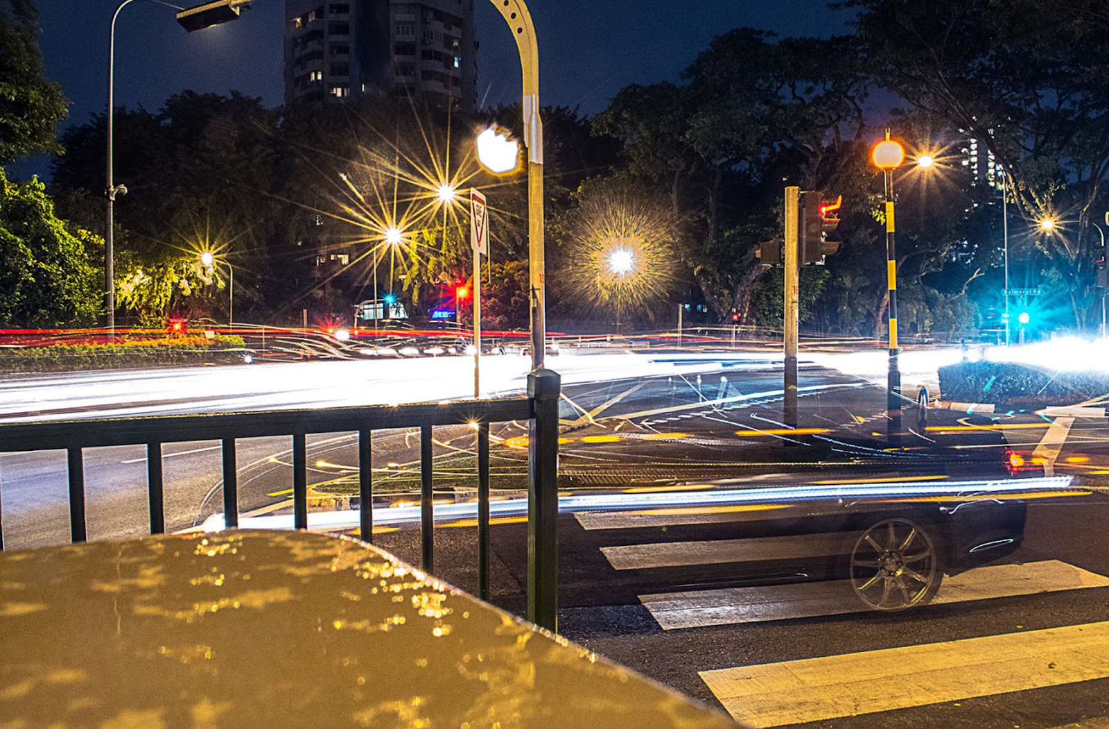
Shutter speed is the exposure time or length for how long light is let into the camera, creating a blurred motion effect or still motion depending on what you set the shutter speed for. The amount of light that reaches the film or image sensor is proportional to the exposure time.


The first picture shown is a still motion picture. The shutter has a high number setting letting the motion be captured without a blurring effect.
still motion of spinning fan 

blurred motion


Some difficulties I have come across have been light exposure while taking photos and just overall camera knowledge since I haven't really used a digital camera before. I think some successes have been the first still picture with the water. I think the lighting and editing overall of the photo is sharp and well contrasting because of the basic background of the photo.


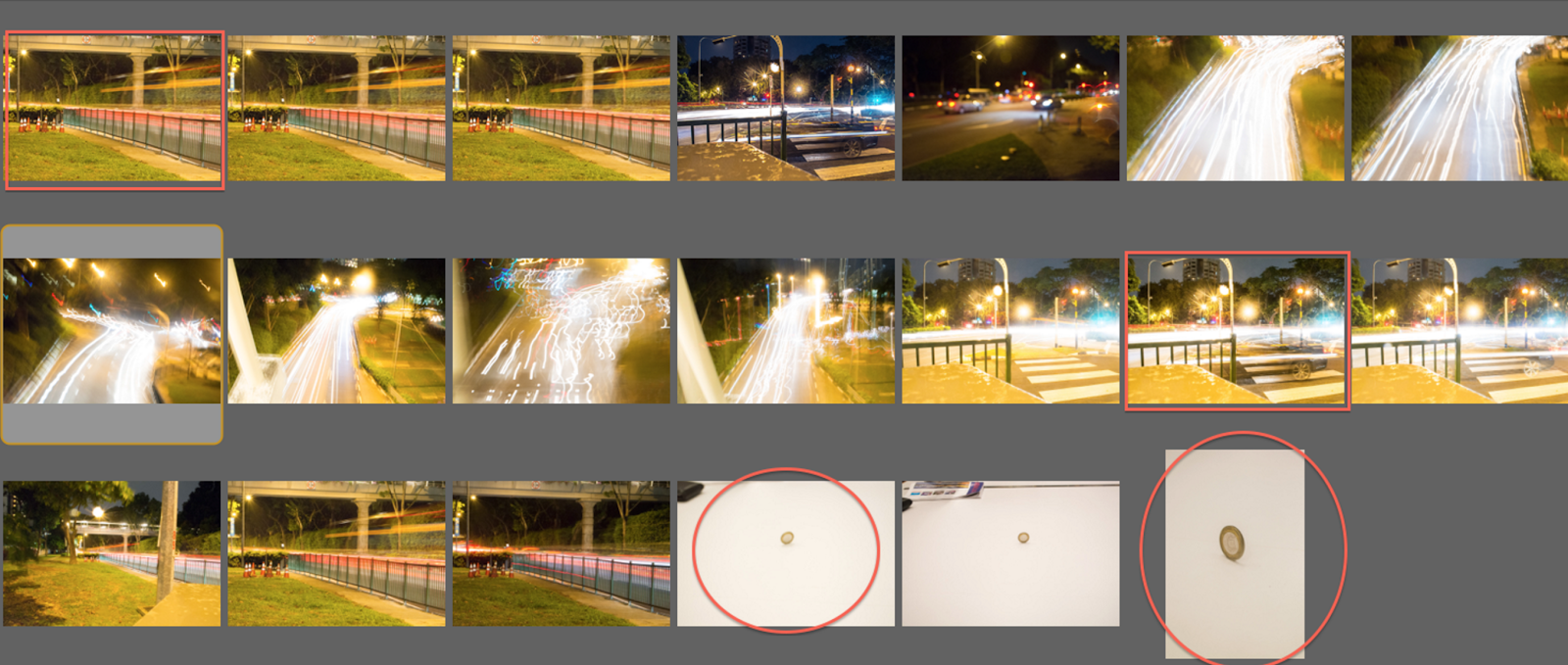
The Blog Post: The order of the content of the work is not chronological (explanation of the shutter and how it affects the image, digital contact print, description of the digital contact print, final edited images with a description, successes and challenges to the project).
There is no explanation to the digital contact print. The layout and the font size and type is unorganized and varies.
The Images: There are only three images for the final. One more example of frozen motion is needed. The last image when viewed larger does not increase in size to be able to view the details.

Tuesday, April 12, 2016

Digital Photography - Shutter Speed C+


Shutter:
The shutter is a curtain that can be opened and closed. The defining feature about the shutter is that the time in which it can be opened can be adjusted.

Digital Contact Print:

The top left image was selected due to the blur that is happening in the back of the image. When I first saw examples of images there was only motion blur occurring in the front of the image. To try a new angle I took pictures of traffic at night from 5-ish meters away from the road. This allowed for the crisp gate in the front of my image that is in front of the motion blur.
The second motion blur photo I selected due to the length of the shutter speed. For this image I had a 15 second exposure which allowed me to capture the movement of traffic as well as a car at the light for a few seconds. This longer exposure allowed for a fade of the car at the light to happen in the front of the picture as well as the headlights of other cars to occur int he back of the photo.
My third selected photo was a freeze motion photo. I selected this because of hoe much white space there is. I find it interesting how little is going on around the frozen coin in the center of the photo. I also like this photo because of how the bright lights of the classroom match well with me exposure to allow for a crisp image of the coin.
My final image was a zoomed in photo of a frozen coin. I like this image because of how much detail is able to be seen and the shadow coming off of the edge of the coin. Though this image is similar to my previous frozen motion photo the rigid coin standing so straight creates an interesting image.

Success/Challenges:
After this first project and my first time really using a digital camera I realized how hard photoshop is to use. Since I am very new to the program the movements and controls are hard and easy to forget. I have a new respect for photo editing and the entire photo process. Something that I felt I did successful in this project was my motion blur photos. I really like how I was able to experiment with the shutter settings to get unique and interesting photos of cars at night.

For my first image of motion blur I took a photo of a SMRT bus traveling down Bukit Tima Road in the evening. With the fence focused on in the front the bus's display board has created a blur line above where one would expect. Compared to my other motion blur image the headlights have been blowed at half a meter above the ground creating a uniform blur. In this image the blur is at the top of the image drawing the eye up past the still fence.

For my second motion blur image I have the very standard headlight blur of cars but with a half blurred parked car. With this half blurred car one is able to see through it to more motion blur of traveling car headlights in the background. This image was also taken in the evening allowing for the headlights to look like stars do to the stability and shutter speed of the photo.

In this frozen image I took the photo with little zoom allowing for a lot of white space around the frozen coin in the center. With all the light in the classroom the coin almost reflects life while it stands so still on the table. This image was take early on in the unit but I enjoy how crisp and in focus the coin is.


The blog post: The digital contact print is too large for the web page. This can be reduced in size, or make adjustments to the web page width to fit the digital contact print.
The explanation of the shutter does not explain how it affects the subject of the image. The post is not in chronological order (explanation of the shutter and how it affects the image, digital contact print, description of the digital contact print, final edited images with a description, successes and challenges to the project). There is no explanation of the final images.
The images: The two examples of freezing images are very similar and could very well be the same image zoomed in. A variation of selections would be helpful. 

Sunday, April 3, 2016

PTA Sponsored Academic Visitors in Residence Program 2015/16

Throughout the school year Singapore American School has had the pleasure to host a number of visiting artists within the high school visual art suite. Two hundred art students from the printmaking, art foundations, digital photography, and advanced digital photography courses had the special opportunity to work with these professionals to gain authentic learning experiences within these subject areas. 

Printmaking & Art Foundations Classes Tamae Iwasaki the senior education and outreach officer from the Singapore Tyler Print Institute (STPI) provided workshops for the art foundations and printmaking courses. Students were introduced to traditional and alternative forms of printmaking and created works using printmaking techniques using a combination of materials. The following workshops during her visits were inspired by the techniques, ideas explored, and used by artists during their residencies at STPI:


Frottage & Rubbing: The process of using drawing tools such as graphite or pastel to make a rubbing over an uneven surface, capturing imprints of textures and forms inspired by Korean artist Do Ho Suh residency project at STPI.
Image curtesy of STPI


'Poor man's Lithography': Students created their own fantastical creatures using an alternative form of lithography inspired by Filipino artist Ronald Ventura residency project at STPI.

Image curtesy of STPI

Jane Lee inspired mono-print and screen print: Students created an inspired mix media print artwork using a combination of mono-print and screen print. Singapore contemporary artist Jane Lee moves away from abstraction and formal explorations to painting to discover print and paper, combining unconventional materials to produce dynamic installation works that fully immerse the viewer, as she considers themes of entrapment and freedom, taking on a figurative approach through new visual metaphors such as birds and nature.

Image curtesy of STPI

Ryan Gander inspired Cyanotype & Screen print workshop: Students layered images of screen print on top of the Cyanotypes. UK artist Ryan Gander embarked on his STPI residency with an inquisitive and experimental mindset, exploring the countless possibilities and processes of printmaking.
Image curtesy of STPI


Relief prints inspired by Eko Nuguroho: Indonesian contemporary artist Eko Nugroho uses comic and graffiti-inspired iconography to cover a range of political and socio-economic issues within his artwork.
Image curtesy of STPI


Photos and screen printing inspired by the work of Lieko Shinga: Japanese artist Lieko Shinga creates a stage for both humans and locations and recaptures it through photography, turning the ordinary into the extraordinary. She has created a mise en scène for her subjects, accentuating their dramatic qualities through further manipulation with print. The juxtaposition of real people and their illusionary surroundings, provides unease and evoke a surreal, mysterious quality to her work.
Image curtesy of STPI

Here are a few excepts from a few student blog posts from the workshops:
It was a privilege to have professionals in the printmaking field help to teach us during our printmaking unit. I was thankful STPI taught us a completely new skill. 
We learned to create 3D prints, by wrapping our chosen object with Japanese printing paper. Then we painted it with only water, and left our piece out to dry. The next class we returned to find our papers had taken the shape of the object we chose. We then glued our 3D shape onto a piece of poster paper. Then we started experimenting with 2D printing, and tracing a variety of textures outside the classroom. I found a few plants, bricks, and I also used the interim tiles for realistic shapes. Next, in order to avoid the graphite and charcoal rubbing off, we sprayed the printing paper. Finally, we cut/tore the 2D prints and created a mixed media collage on the poster paper. 
My mixed media collage consisted of cut out shapes from magazines and ripped pieces of my 2D printings. Overall, I enjoyed stepping outside of my comfort zone during this project, but I struggled with creating the 3D print on the first day. Even though the key focus point of the art piece was difficult I am proud of my 2D printings, because in my final project I created a harmonising theme of Singapore in my work.
Stacey Peuplie

In the end, I think I took away a life lesson that would help me in the future. The STPI Workshop Visit taught me to persevere even if things aren't going the way you planned it to go in the beginning. I hope to visit STPI soon to learn and improve my printmaking techniques! 
Elysia Chang 
  
Initially, I thought my print wouldn't turn out that good since this was my first experience with printing using the silk screens, however, after helping others print their screen prints first, I got some tips on the silk screen printing process which I used when making my own print. Another success I had with this project was with the overall tone of the piece. 
At first, I was worried that the competitive, intense tone I was going for with this project would be ruined by a small mistake. However, while working on this piece, I was familiar enough with the printing process to the extent that I didn't make any mistakes while working on this piece.
Dwayne Pereira 


I really like the way the foil transferred onto the background image and I think the final result of the screen print image and the written narrative was really successful, overall I really liked the results of this project and I thought it was really fun to learn about new techniques and to get a tutorial from professionals.
Traci Player 
Image curtesy of Zul Monsor

Image curtesy of Zul Monsor
Digital Photography Classes
The digital photography courses were privileged to host Wesley Loh and Tom White from Objectifs centre for photography and film. Both photographers have worked extensively within the field of photography with a wealth of industry knowledge in the subject of portrait photography.

Based in Singapore, Wesley has established his credibility with his unique style and personable approach. As a photographer, Wesley's eye for capturing life has helped corporate outfits portray a more human and friendlier side to their images. Educational institutions have also sought Wesley's help to present the essence of school life through photography to students, teachers and parents. He set up Memphis West Pictures in 1997, and has shot for many clients ranging from international companies (e.g. McDonald's, Hewlett-Packard, Citibank, Oracle, Holiday Inn) and local institutions (e.g. Theatreworks, National Heritage Board, People's Association). 

Tom White studied Fine Art at Goldsmiths College, and Photojournalism and Documentary Photography at the International Center of Photography in New York. He has taught classes at Columbia University's School of Journalism and at the International Center of Photography. Tom's work has been published in the US and UK, including The New York Times. 

Wesley and Tom's workshops consisted of studio and environmental portrait photography which covered topics such as working with studio lighting, working with natural light, telling a story about your subject and his/her environment, finding the right moment, and interacting with their subject. Students explored these topics while capturing the portrait within a controlled lighting studio and out and about within the natural environment.

Here are a few excepts from a few student blog posts from the workshops:

This project was a challenging one for me. It was my first time working with studio lights. As a result most of my time was spent experimenting and trying to get the lighting right. However, in the end I found I managed to get the right lighting and exposure for the shots. Another challenging thing for me was approaching people for my environmental photography. At first I thought the idea was really weird, so I tried to approach people I knew so I felt more comfortable. However, as time went on, I started to feel more and more comfortable, I started asking people I didn't know. In the end I feel I effectively overcame the challenges of this project to produce pictures that are appealing to the eye.
Atulya Venkataraman 


Overall I think this project went wonderfully because I had a lot of fun, and it has inspired me to try and capture people's characters through photos. It is such a unique experience to attempt to build some sort of connection or understanding of someone in just a few minutes.

Samantha Monteville 
 
In environmental portraits, I was really uncomfortable with asking people if they could model for me. So, I decided to secretly take photos of my friend while she photographed her subjects. It came out great. By photographing people naturally and not asking them to pose, the mood in the photograph is more...natural. And by not planning it gives rise to accidents. Art is all about accidents.

Rebecca Dai 
Image curtesy of Zul Monsor

Image curtesy of Zul Monsor

Image curtesy of Zul Monsor

Image curtesy of Zul Monsor

Advanced Digital Photography
The advanced digital photography class had the unique opportunity to take two workshops in food photography and macro-photography. Canon Imaging Academy (CIA) trainers, Nugene Chiang and Joseph Goh, provided a range of various essential shooting techniques and tips and tricks to capture great shots.

Nugene Chiang shared his knowledge on how to photograph food at different angles and compositions. The students learned how to style food and take pictures under different lighting conditions. Nugene Chiang has been a trainer at Canon Imaging Academy for the past 4 years, sharing his knowledge of photography with customers and workshop participants. His passion for food photography is backed by his experience as a commercial/stock photographer of 11 years.

Macro Photography is one of the hardest photographic topics to master hence a good understanding of all the aspects is critical to get the best results. Joseph Goh who is also a Canon Imaging Academy trainer and multiple award-winning photographer provided his industry secrets with the students in capturing amazing close-up shots.

Here are a few excepts from a few student blog posts from the workshops:

The theme for this project was everything food. Nugene Chiang, a stock photographer and resident trainer at Canon Imaging Academy, came to our classroom to teach us about being in the photography industry and how to photograph food. We learnt about how to use LED lights to create interesting lighting indoors and how to utilise a background to bring out qualities of the food in the foreground.  

What Nugene had to say about the photography industry, from stock photography to contract photography, was also really eye opening. Especially the fast pace lifestyle of a stock photographer, and the wasteful habits of food photographers. In this short workshop we were able to photograph food without ruining the food with spray paint and props as is too common in the food photography industry today. 
Patrick Koopmans


For this workshop, we had an individual named Nugene Chiang from Canon come and teach us how to take pictures of food. He explained to us that there is more to this style of photography than just taking the photos. In this area, you also have to work with food and be able to style it in a way that is pleasing to the eye. He explained that this is the hardest part as the food has to be able to stay the way you position it to look the most appealing. While listening to him speak about his experiences working with food, it didn't seem like it would be much of a challenge, but throughout the workshop we all learned how much harder it actually is. Not only does the positioning of the food matter, but the placement and addition of extra props in the background can also reflect the photo.

Nugene explained how the placemat used behind adds to the atmosphere of the photo and how placing ingredients behind the dish can also show the viewer what kind of dish it is. For example, by placing spices behind the dish, it can be insinuated that the dish is spicy.

Kaitlin Crawford


For this project, we were taught by Joseph Goh, a cannon photographer. He mainly takes macro photographs as he finds that it is the most interesting and versatile form of photography. I learned a lot from him but maybe the favorite thing I learned was how to get a black background on macro images using fill flash. He also told us to take images in manual which pushed me to think more about the flash and aperture together rather than putting the camera in shutter or aperture priority. He also shared angles and how to get nice shadows in our images.  

I learned that, as a rule of thumb, the angle you shoot at should be lower down when capturing insects as you capture the more interesting parts and get a better black background due to the lack of things in the background. I really enjoyed working with Mr. Goh and understanding the methods to take good macro pictures, I also enjoyed learning about the equipment as this is a form of photography I would like to do more with in the future. 

Amey Bafna


Macro photography is a type of photography in which photographers will go really close to their subjects. Joseph Goh, a Canon camera trainer and macro photographer, led a workshop with our class regarding macro photography. This was a very unique experience since it revealed a world which is unbeknownst to the naked eye. The macro lenses we used in the workshop is able to capture even the smallest of details, almost as if looking through a microscope lens.


Joseph also described the dangers macro photographers may encounter in the wilderness, such as poisonous bugs or animals. Joseph even told us an anecdote of how he had climbed a tree to take a photo of a dangerous wasp nest! It just goes to show the great lengths some dedicated photographers go to get the perfect shot.

Jake Bengco


Image curtesy of Zul Monsor

Image curtesy of Zul Monsor

Image curtesy of Zul Monsor

Image curtesy of Zul Monsor


Tuesday, March 22, 2016

Still Life Drawing- A+


In order to draw a still life drawing, you must first place the objects in either one of these placements: Triangle, where the objects are placed to form a triangle, Cropping, where the objects are not entirely in the frame like this drawing, Framing, where there is one key objects and the rest surround that object (the edges of the paper can be part of the frame) and Rule of Thirds, where you draw 2 horizontal and vertical lines and make the objects' center match up with the lines.

I chose to use cropping (although it may also look like a triangle) because I wanted to draw using a compositional device that I've never used before. And since this was my first time drawing a still life, I wanted to focus on the shadows and making sure that the placement of the objects in real life and on the paper is as accurate as possible, and I felt that cropping will help my focus be geared into the details more than just trying to make the drawing look good overall.

For the steps in drawing a still life, we first need to frame our white paper (create a boarder) and use charcoal to grey out the inside of the frame. this creates the consistent background to work with that we can later on erase or add on to create depth. Then we render the outline of the object, taking the apple as an example, I would approximate the size and draw several light circles to get the overall shape. Then going over the light circles to create a more accurate shape of the object and darkening the outlines. After the outline is done, the next step is to get the overall contour of the object, making sure to colour in the shape of the object. So if I'm trying to contour the apple, I wouldn't just colour in straight lines, but curved lines. To create depth to the drawing, we will use our charcoal and white pastel to darken and highlight where the light hits the object. Usually, for every darkened area, there is a highlight right next to the area. Once that is done, colour in the shadows using charcoal to darken the shadows and making sure that the shadow right underneath the object is the darkest and lightening up as the shadow extends.

Despite this being my first time drawing a still life, I think I did a really good job capturing the details in the objects and successfully make them look realistic. I worked hard in making sure the contours are drawn in relation to the actual curves of the objects. I am most proud of my glasses, since that was the object with the most intricate shape and the shadows are not the typical shadows I thought I would see. I think the hardest part for me was the contouring because that was going to be the base of all the contrast I was going to work on and the relationship between each object (in line, a little behind, parallel) was difficult for me.

Artwork: The student used three complex objects with a strong placement that follows two compositional devices, a full range of tonal values, and shading along the contour.
Blog Post: All areas are complete with a detailed explanation

Still Life Drawing- A


  The steps to drawing still life are as follows:
1) Set a tonal ground by going over your paper with charcoal and blending it.
2) Render your objects by loosely drawing the basic shape with a dull pencil.
3) Contour the specific shape of your object by scanning the outline and drawing what you see (Tip: always be looking at your object when contouring).
4) When deciding where to shade, find the lightest and darkest value first, then add all the middle values.
5) If shading an object with a specific curvature, shade in the direction of the curves to add realism.

In class we learned about the various computational devises to use to make your drawing more interesting, such as the two triangular positions, cropping and framing.
I used framing for my still life, because I like it when the objects are close together. Also, it adds a 3D affect to my pear because it is over lapping the roller thing.

Before we rendered our objects, we covered the entire page with a light coat of charcoal to set a tonal ground. After rendering my objects, realized I put a little too much pressure on my initial background toning, so I had to erase a little bit around my objects to have a clear contrast between the background and the actual objects.


As for the shading, I found it most difficult to shade to pear because it was hard to see some of the light reflections on such a dull object. The object I'm most proud of is the roller thing because the pure black values add a lot to the drawing. The bit of advice that helped me the most was: "when you're having trouble with shading, start with the lightest and darkest areas, and go on from there". 


Artwork: The student used three complex objects and followed each of the four steps of completing the drawing with a good deal of success. Two things separating this drawing from a A+ is the transition from the object and background in light values (the objects at the top of the drawing looks to be 'glowing'), and the foreshortening of the shell and the brayer were not fully realized. Further erasing of the background just beyond the objects to reflect the light values more evenly would reduce the look of 'glowing' objects. The shell and brayer portions closer to the bottom of the drawing would need to be drawn larger to project the illusion of a depth of field within the drawing.
Blog post: All parts of the descriptions and explanations are provided, although 'computational devises' should be 'compositional devices' and the rule-of-thirds was not included in the description. 
  

Still Life Drawing - B+


During the 'Still Life Drawing' phase of our learning in Art Foundations, we went through multiple variations of drawing still life objects. In the end of our unit, we completed drawing three still life objects and my end product can be seen above.

The first step of the process leading to this product was picking three objects. After picking my three objects, I positioned them around the table until I had a clear line of sight of what I wanted to draw. I decided to use the cropping and line of thirds methods in order to create my piece in order to make my subjects more prominent and stand out. The cropping method is where you position your object so that it is cut out from the picture, giving the artwork a form of perspective. The line of thirds method is where you have a three by three square grid and  you align your objects/subjects along the lie and points created by this grid. This method is great at giving your subject the most prominent look. After positioning, I set the tonal ground of the drawing by  shading the paper with vine charcoal. I then rendered my objects, creating the general shapes and form of my subjects. After that I contoured my object, I did this using a pencil (2B and HB) and vine charcoal and outlined the shapes of my subjects and their shadows. My light and dark values were then added, placed accordingly to what I saw in the objects. For this value placing process, I used my pencil, vine charcoal, blending stick and white chalk to add areas of pure black, pure white or in between. You can see in my drawing how I placed pure white values for the reflections in the light bulb and how I used pure black values for the lid of my water bottle. Finally, I finished off my piece with surface contour shading in order to blend values and make outlines more visible.

All in all, I am proud of my final work and experiencing the journey of making it. There were challenges and successes that I encountered along this journey. One of these challenges was drawing my banana and having it look 3D. One of my successes was placing correct white values along the rim of my water bottle in order to make it 'pop' and look realistic. Placing values is my weakness but I feel that this product proved how much I improved on doing that. I enjoyed creating this artwork and proud of what I have accomplished.


Artwork: The student had chosen more complex objects to draw and experimented with two different compositional devices (rule-of-thirds and cropping) with some success. The banana and water bottle were following the rule-of-thirds and the water bottle follows the cropping compositional device. The student also experimented with foreshortening with the banana with some amount of success. The front of the banana should be larger in size as it is closer to the viewer and some further refinement in following the contour shading with the water bottle and banana would move this drawing into exceeding expectations.
Blog post: All steps to creating the drawing is included with the successes and challenges to the project. The student misuses the term 'rule-of-thirds' as 'line of thirds' and would need to revise this.   

Still Life Drawing- B


In this drawing I used several new techniques, for example I used the rule of thirds to position my items. To add value to my drawing I used many different types of pencils, such as, 2 H, 4 B, and 5B, I also used charcoal to create an absolute black and I used a white chalk to add more of a contrast between the lights and darks. One of the challenges I faced while creating this piece was ignoring my instinct to look down at my paper and draw what I thought the object should look like rather than just looking at the object the whole time I'm drawing.


Artwork: The drawing is meeting the expectations in following the four steps in rendering, follow the contour, light/dark placement, surface contour shading. The light/dark placement and shadow placement can be further refined to move towards exceeding expectations.
Blog post: Explanation to the steps in creating the still life drawing is partially complete and can be more descriptive. A description of rendering, follow the contour, and surface contour shading as terms and techniques used in the process should be included. In addition, an explanation to the rule-of-thirds as a compositional device can be included.